今回は、「フレックスボックス内での配置」について学習します。
前回は「display: flex;」を使って親要素の中で、どのように子要素を並べ替えるのかを学習しました。
今回は、横に並べた子要素をどのように配置するのかを見ていきます。
使用するプロパティは、「align-items」と「justify-content」の2つになります。
大変便利なプロパティになりますので、しっかりと覚えていきましょう。
垂直方向の配置(親要素への指定)
align-items
「align-items」は、交差軸方向のアイテムの配置を制御します。
出典:align-items
と書かれていますが、簡単に言うと通常は「縦軸」の位置を指定する時に使用します。
以下に例を見ていきましょう。
align-items: center;
HTML
      <div class="button">
        <button>ホーム</button>
        <button>新着</button>
        <button>HTML</button>
        <button>CSS</button>
        <button>Q&A</button>
      </div>
CSS
button {
  font-size: 18px;
  font-weight: bold;
  line-height: 100px;
  width: 15%;
  background-color: rgba(90, 212, 74, 0.781);
  color: white;
}

.button {
  height: 200px;
  border: 1px solid black;
  display: flex;
  align-items: center;
}
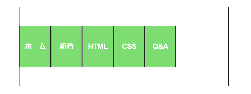
「align-items: center;」でボタンが中央に並びます。
align-items: flex-start;
CSS
.button {
  height: 200px;
  border: 1px solid black;
  display: flex;
  align-items: flex-start;
}
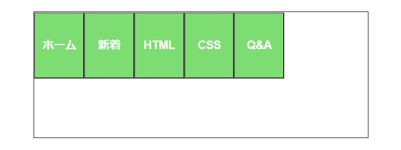
「align-items: flex-start;」でボタンが上部に並びます。
align-items: flex-end;
CSS
.button {
  height: 200px;
  border: 1px solid black;
  display: flex;
  align-items: flex-end;
}
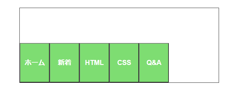
「align-items: flex-end;」でボタンが下部に並びます。
align-items: stretch;
CSS
.button {
  height: 200px;
  border: 1px solid black;
  display: flex;
  align-items: stretch;
}
「align-items: stretch;」でボタンが、ボックスの高さに合わせて伸縮します。
「align-items」の値は他にもありますが、ここでご紹介させて頂いた4つを抑えておけば良いと思います。
一覧表
| プロパティと値 | 動作 |
|---|---|
| align-items: center; | 中央に配置 |
| align-items: flex-start; | 上部に配置 |
| align-items: flex-end; | 下部に配置 |
| align-items: stretch; | ボックスの高さに合わせて伸縮 |
水平方向の配置(親要素への指定)
justify-content
「justify-content」はインラインに沿って配置するプロパティです。
先程ご紹介した「align-items」が縦軸なら、「justify-content」は横軸のは位置を指定します。
以下に例を見ていきましょう。
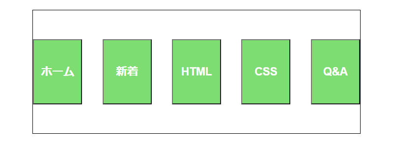
justify-content: flex-start;
CSS
.button {
  height: 200px;
  border: 1px solid black;
  display: flex;
  align-items: center;
  justify-content: flex-start;
}
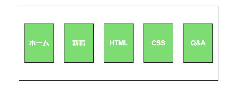
「justify-content: flex-start;」は「左寄せ」になりますので、ここでは特に変化はありません。
justify-content: center;
CSS
.button {
  height: 200px;
  border: 1px solid black;
  display: flex;
  align-items: center;
  justify-content: center;
}
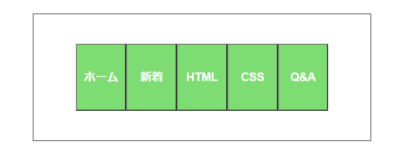
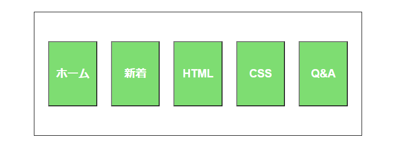
「justify-content: center;」は、「中央寄せ」になりますので、ボタンが中央に配置されています。
justify-content: flex-end;
CSS
.button {
  height: 200px;
  border: 1px solid black;
  display: flex;
  align-items: center;
  justify-content: flex-end;
}
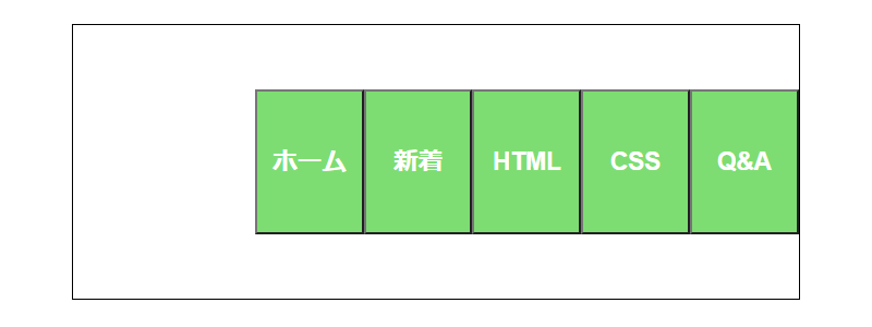
「justify-content: flex-end;」は、「アイテムを末尾に寄せる」ため、右寄せになりますので、ボタンが右側に配置されています。
「right」でも右寄せになります。
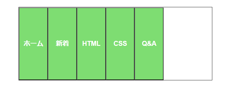
justify-content: space-between;
CSS
.button {
  height: 200px;
  border: 1px solid black;
  display: flex;
  align-items: center;
  justify-content: space-between;
}
「justify-content: space-between;」は、「均等に配置」しますので、ボタンがボックス内に均等に配置されています。
「space-between」では両端にスペースを取りません。
justify-content: space-around;
CSS
.button {
  height: 200px;
  border: 1px solid black;
  display: flex;
  align-items: center;
  justify-content: space-around;
}
「justify-content: space-around;」は、「均等に配置」します。
最初と最後にもスペースを確保します。(要素と要素の間のスペースの半分)
justify-content: space-evenly;
CSS
.button {
  height: 200px;
  border: 1px solid black;
  display: flex;
  align-items: center;
  justify-content: space-evenly;
}
「justify-content: space-evenly;」は、「均等に配置」します。
すべての余白が全く同じサイズになります。
一覧表
| プロパティと値 | 動作 |
|---|---|
| justify-content: flex-start; | 左寄せに配置 |
| justify-content: center; | 中央寄せに配置 |
| justify-content: flex-end; | 右寄せ(末尾)に配置 |
| justify-content: space-between; | 均等に配置 両端の空白スペースはない |
| justify-content: space-around; | 均等に配置 両端の空白スペースは半分 |
| justify-content: space-evenly; | 均等に配置 すべての空白スペースは同サイズ |
あとがき
「align-items」と「justify-content」の沢山のプロパティをご紹介しましたが、一度にすべてを覚える必要はないと思います。
今後学習していく中で、自然と覚えていくと思いますので、まずはどんなものがあるのかを理解しておいてください。
そして、実際にどのプロパティを使用するべきか調べながら書いていくのが良いと思います。
どれにしたら良いか迷うようなときは、実際に比べてみるのが一番良いと思います。
今回も最後までお読み頂きありがとうございました。